We’ve been known as a fun experience provider abroad, but we’ve trained our focus squarely on academic rigor. How do we show prospective partners we’ve changed and ensure students still to want to study abroad with us?
IndustryEducationClientCEA Study AbroadEngagementBranding, Print, Strategy
Background
When CEA first approached us, they were in the process of confronting major change. They had spent a lot of time strengthening their academic programs, but were still known in the industry primarily as a study abroad provider focused more on delivering fun than a serious educational experience. CEA realized they had considerable work to do to shift perceptions among students and existing and prospective university partners. With academic and programmatic changes well underway, CEA contracted with phD to rebrand the company and reintroduce it to students and academic institutions alike.

What sets phD apart is personal involvement of senior team members, a thorough process and a truly collaborative working relationship. For us, the end result was a brand that clearly conveys who we are as a company and where we are going. —
Brian Boubek, CEO | CEA Study Abroad
Approach
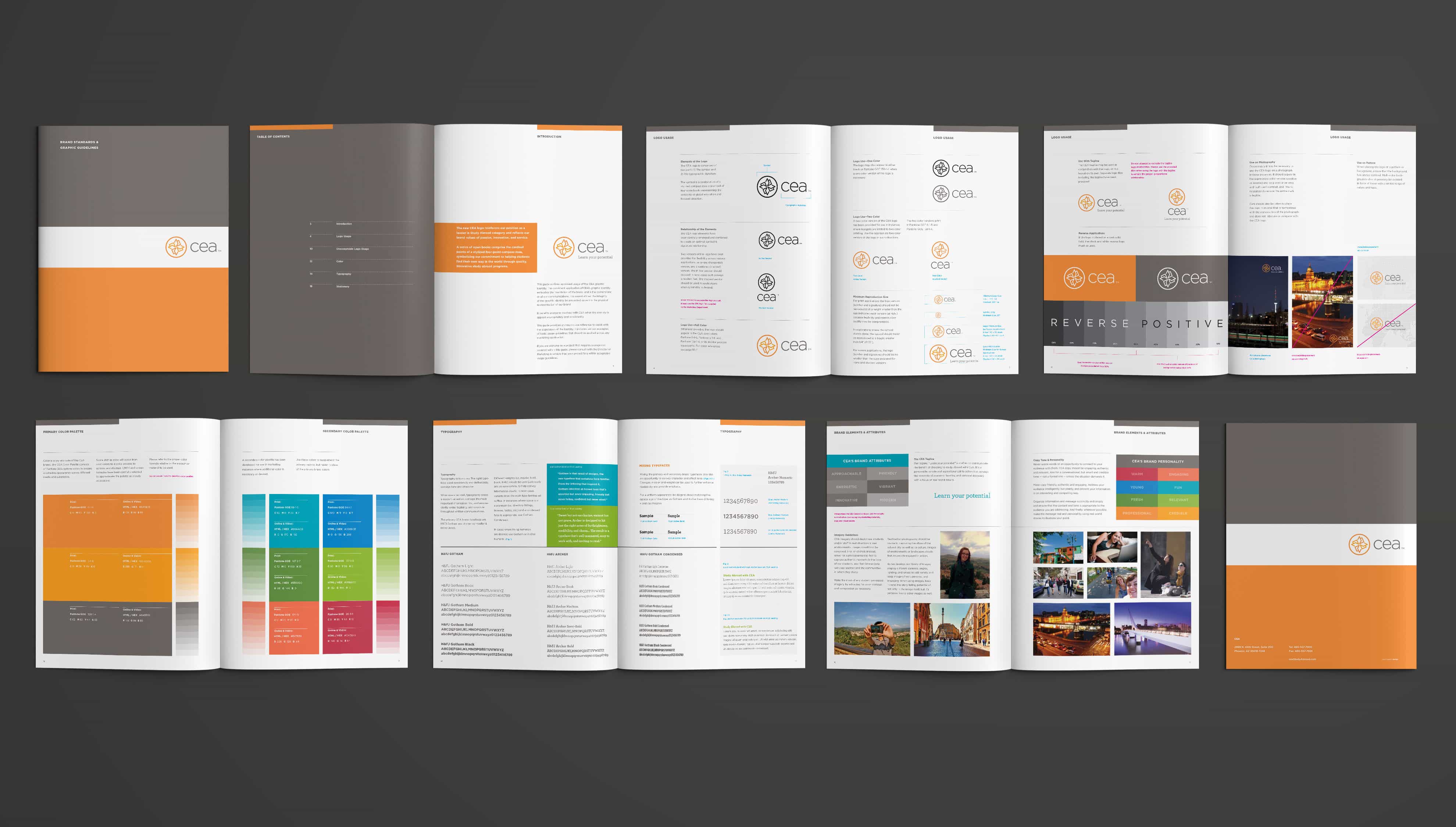
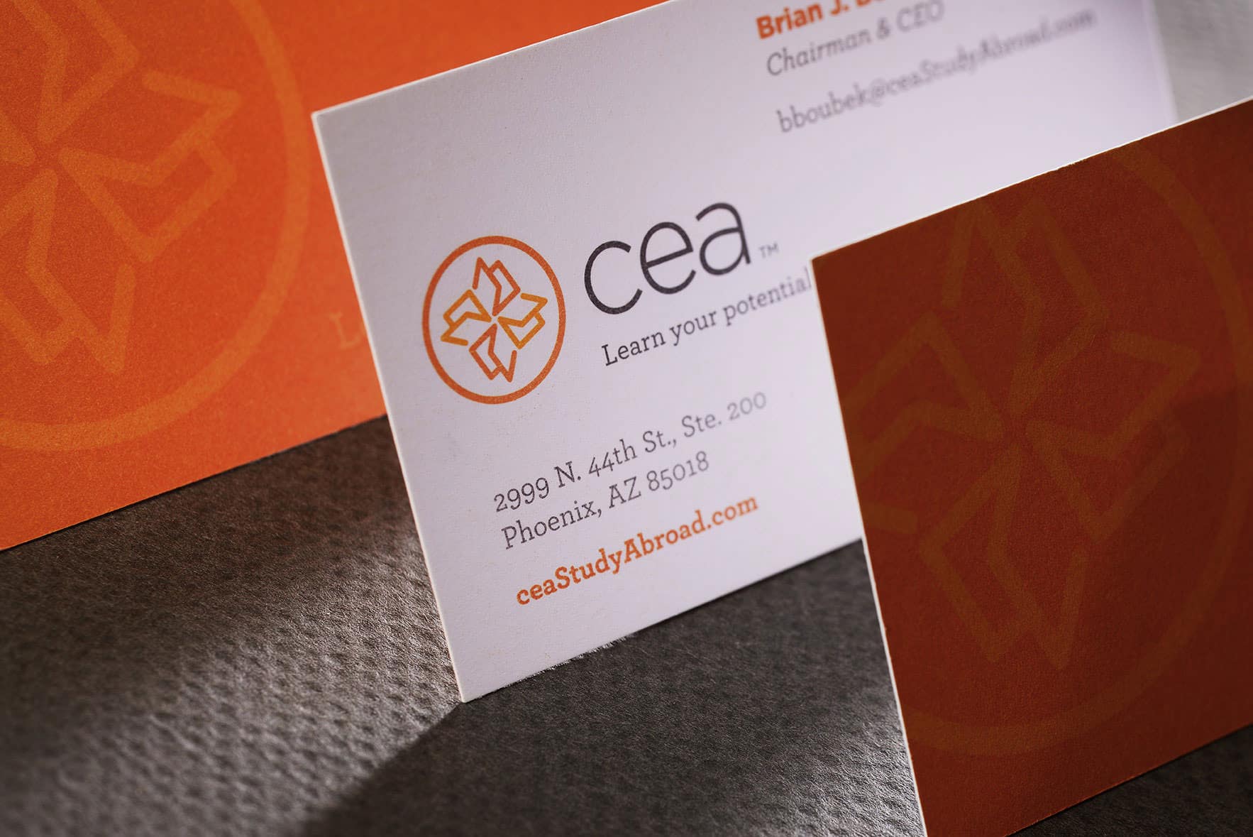
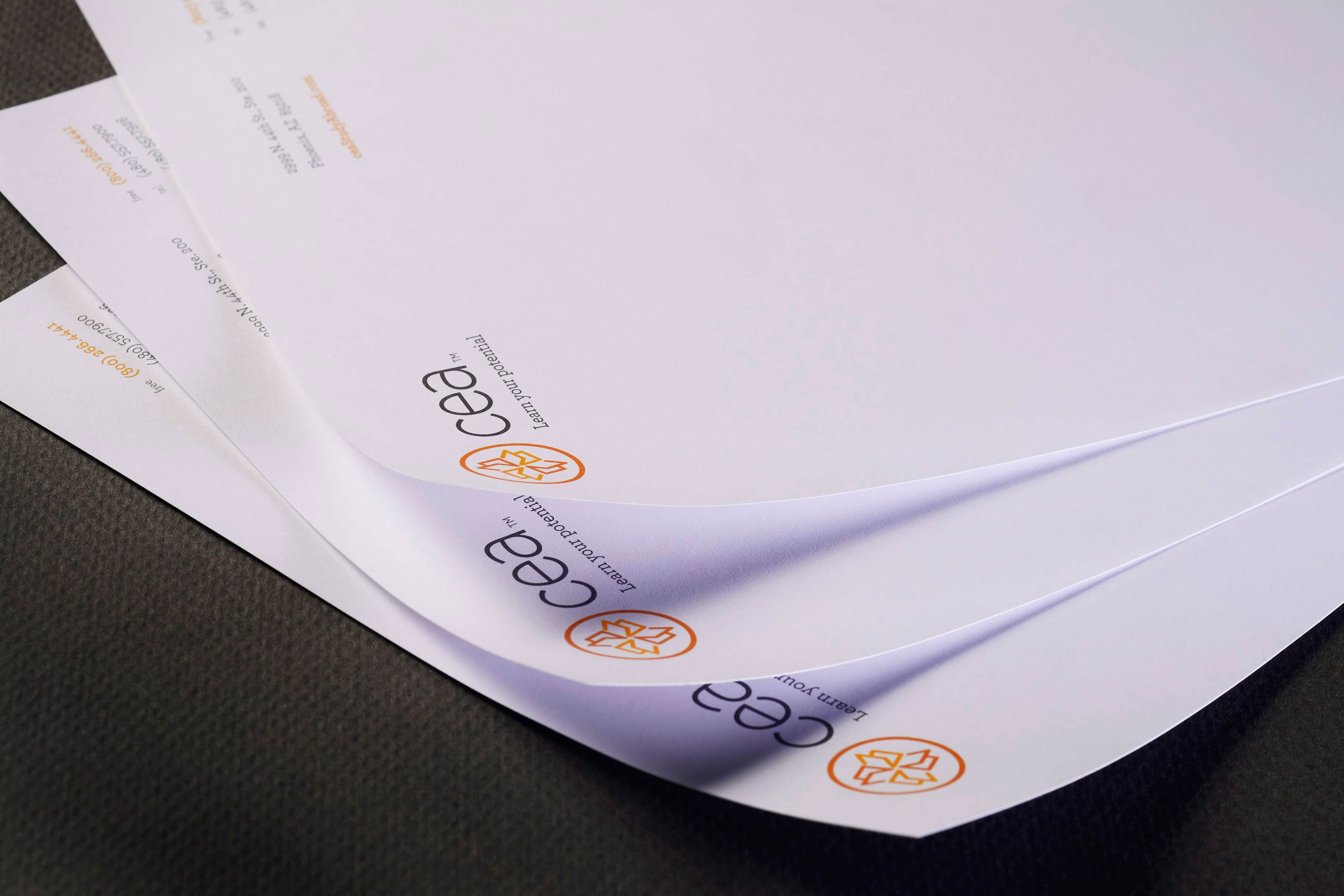
CEA’s original logo design was abstract and not very approachable. As the cornerstones of the rebrand, phD created a new logo design and a tagline focused on the benefits of acquiring global competencies through study abroad.
The logo design features a series of open books comprising the cardinal points of a stylized, four-point compass rose and symbolizes CEA’s commitment to helping students find their own way in the world through quality, innovative study abroad programs. phD crafted the tagline, “Learn your potential,” as a reflection of CEA’s closely held value that study abroad challenges students to grow by opening themselves up to new ideas, cultures and experiences.
We then developed flexible typographic and color systems and comprehensive brand standards covering image and narrative styles to ensure the proper character and tone across both student and academic audiences.
CEA’s new brand reinforces its position as a leader in study abroad programming, provides a warmer, more approachable image and conveys the company’s brand values of passion, innovation, and service.
Brand Extension
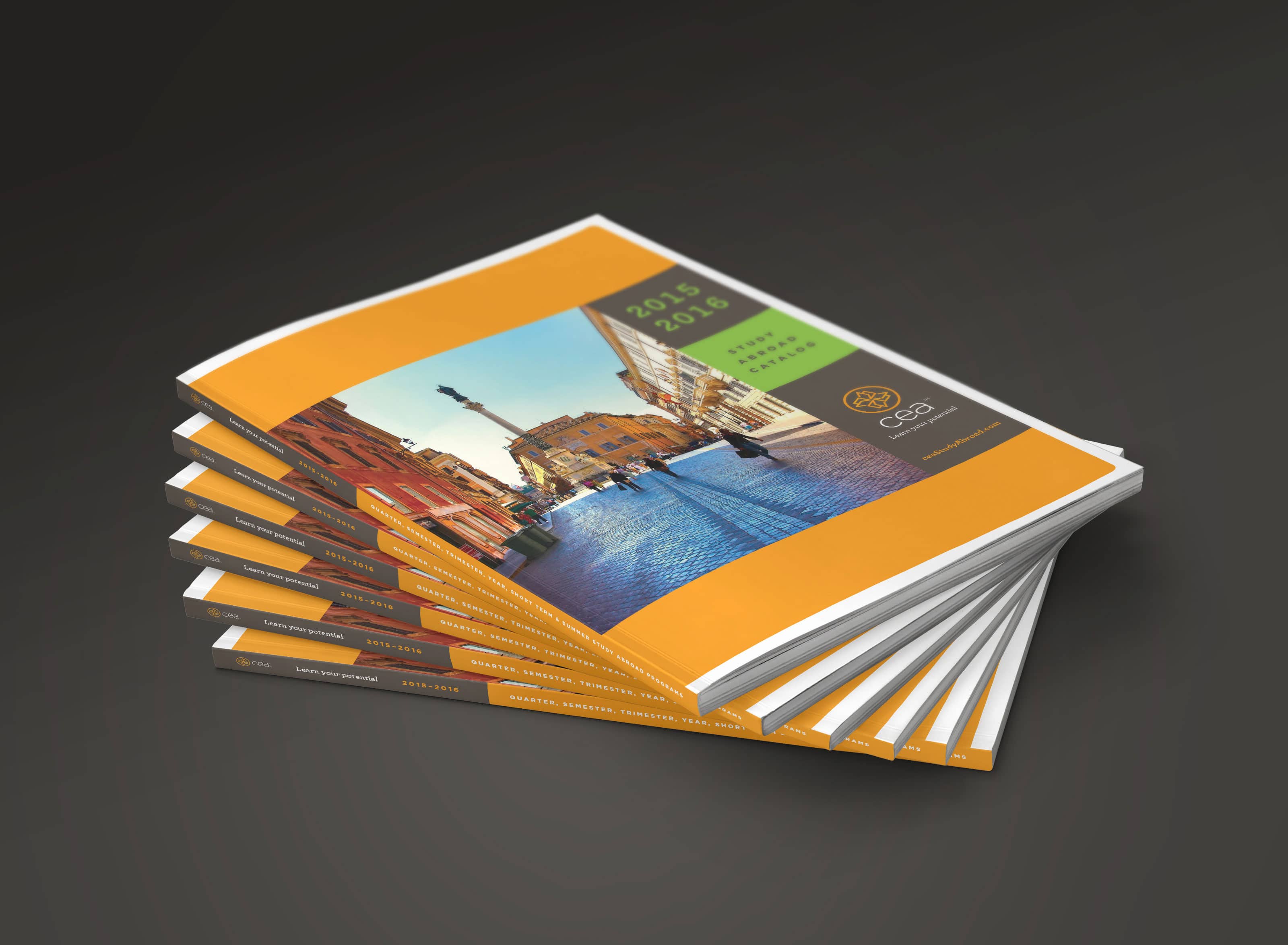
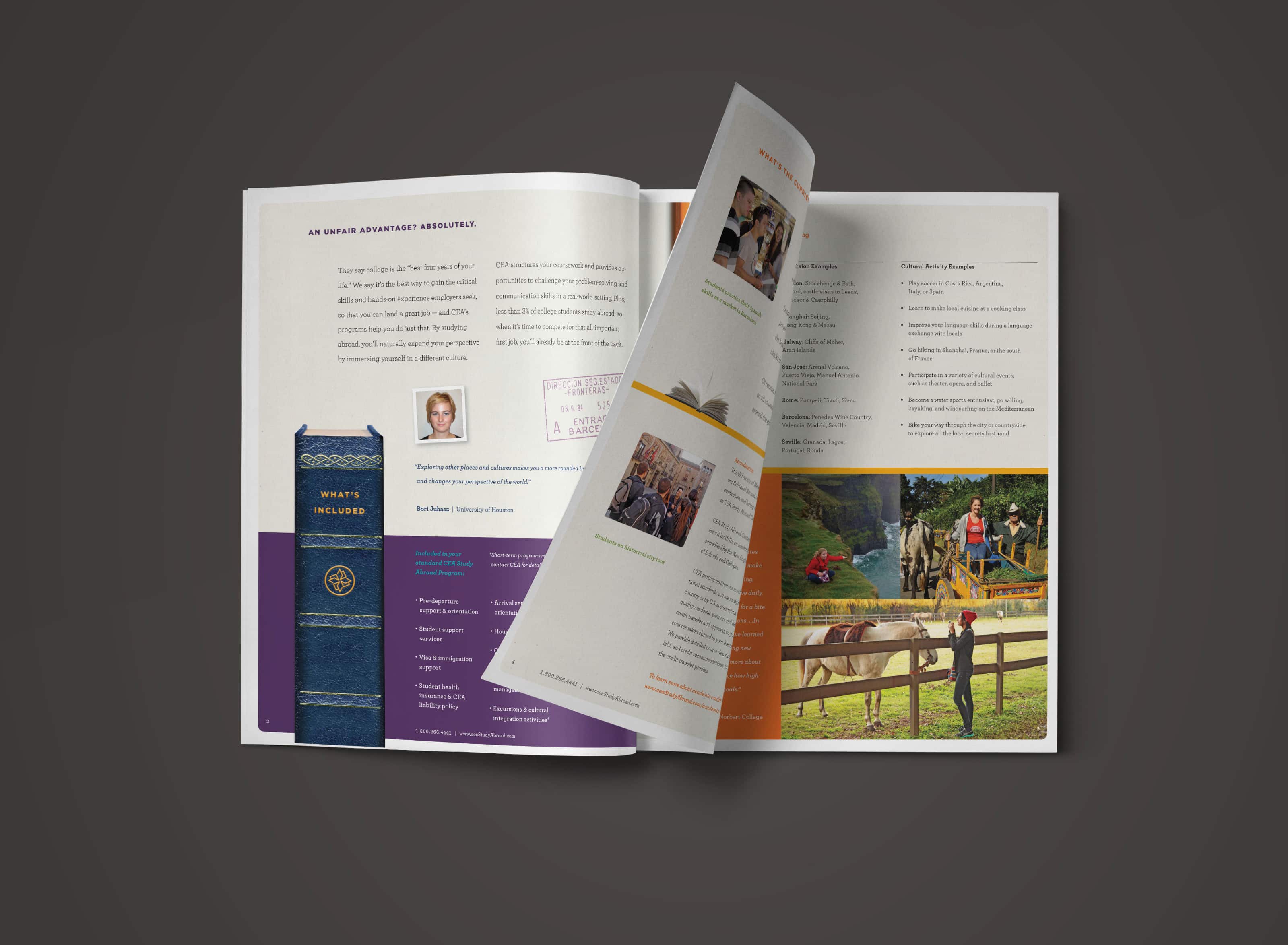
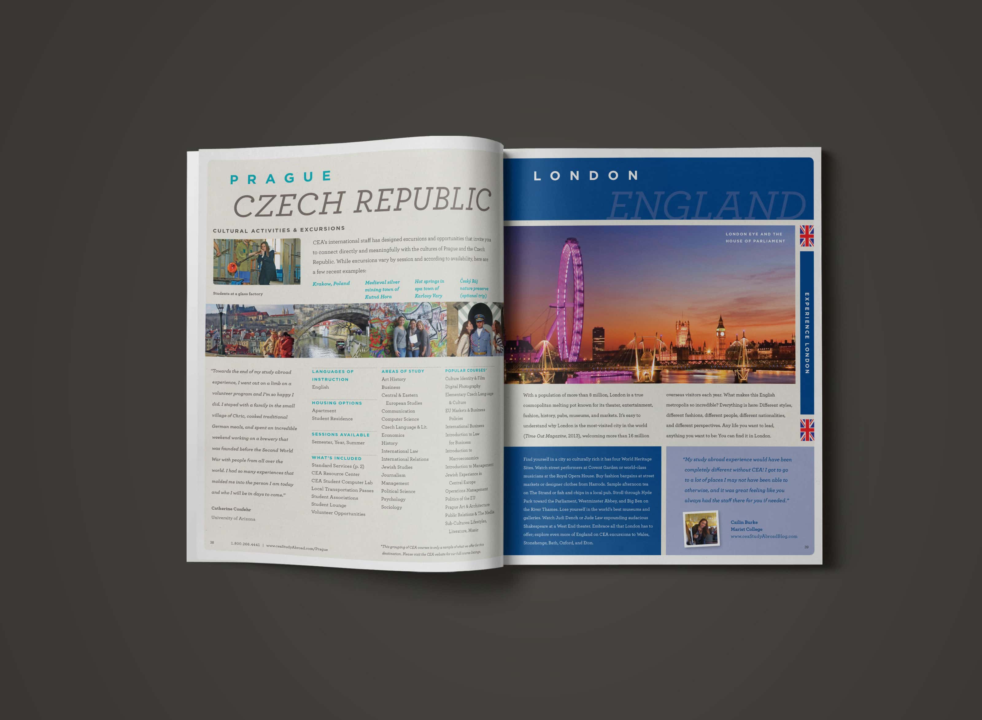
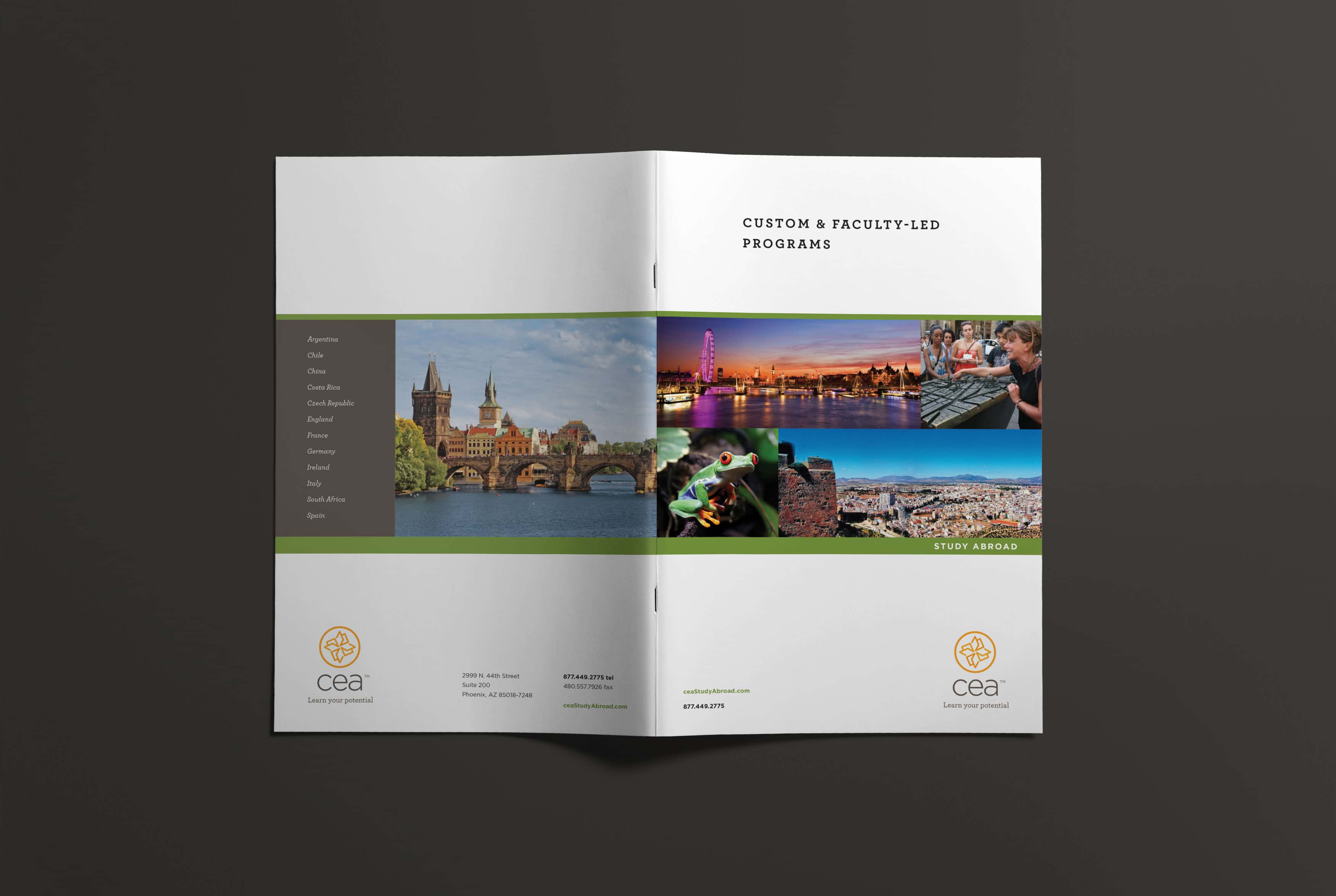
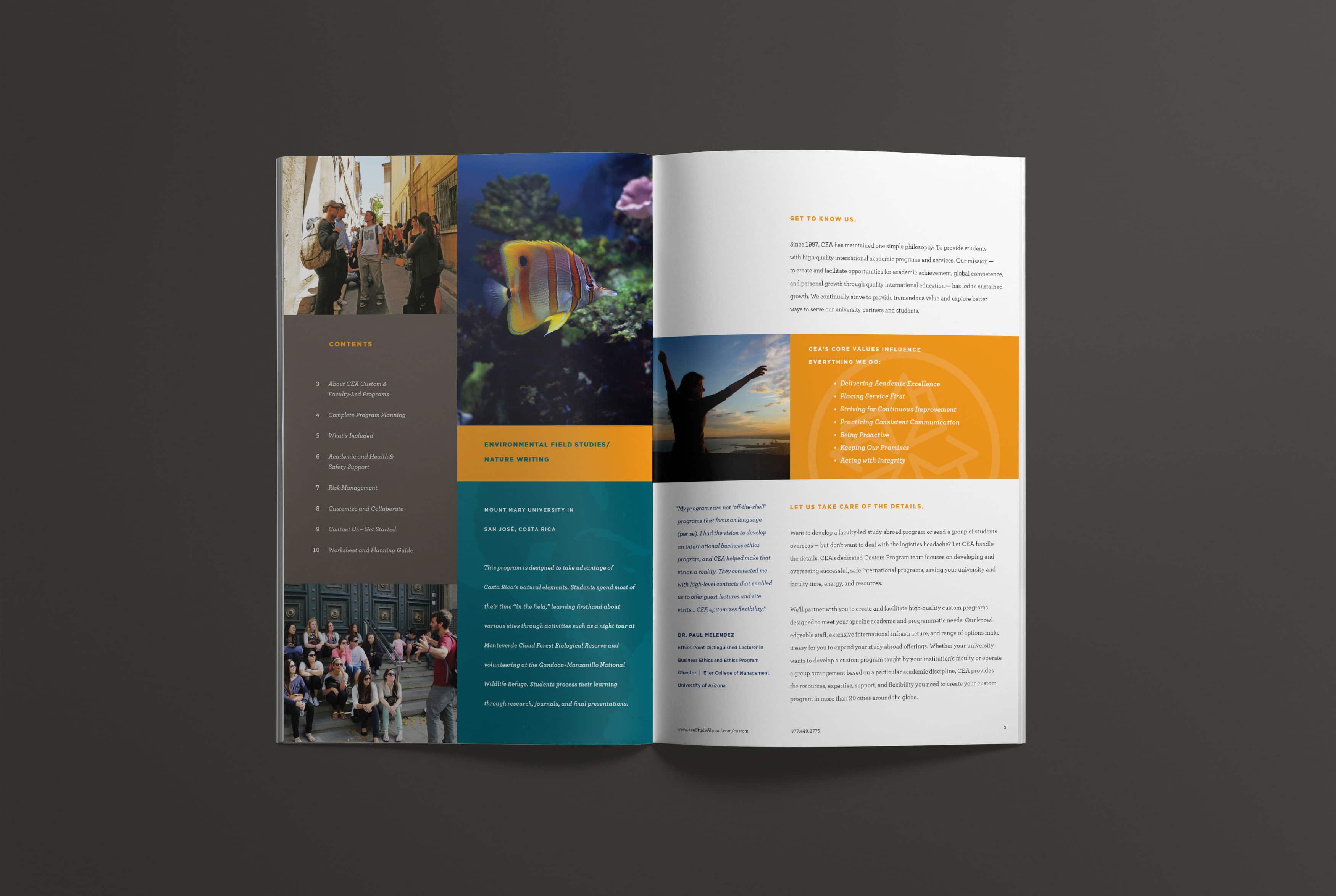
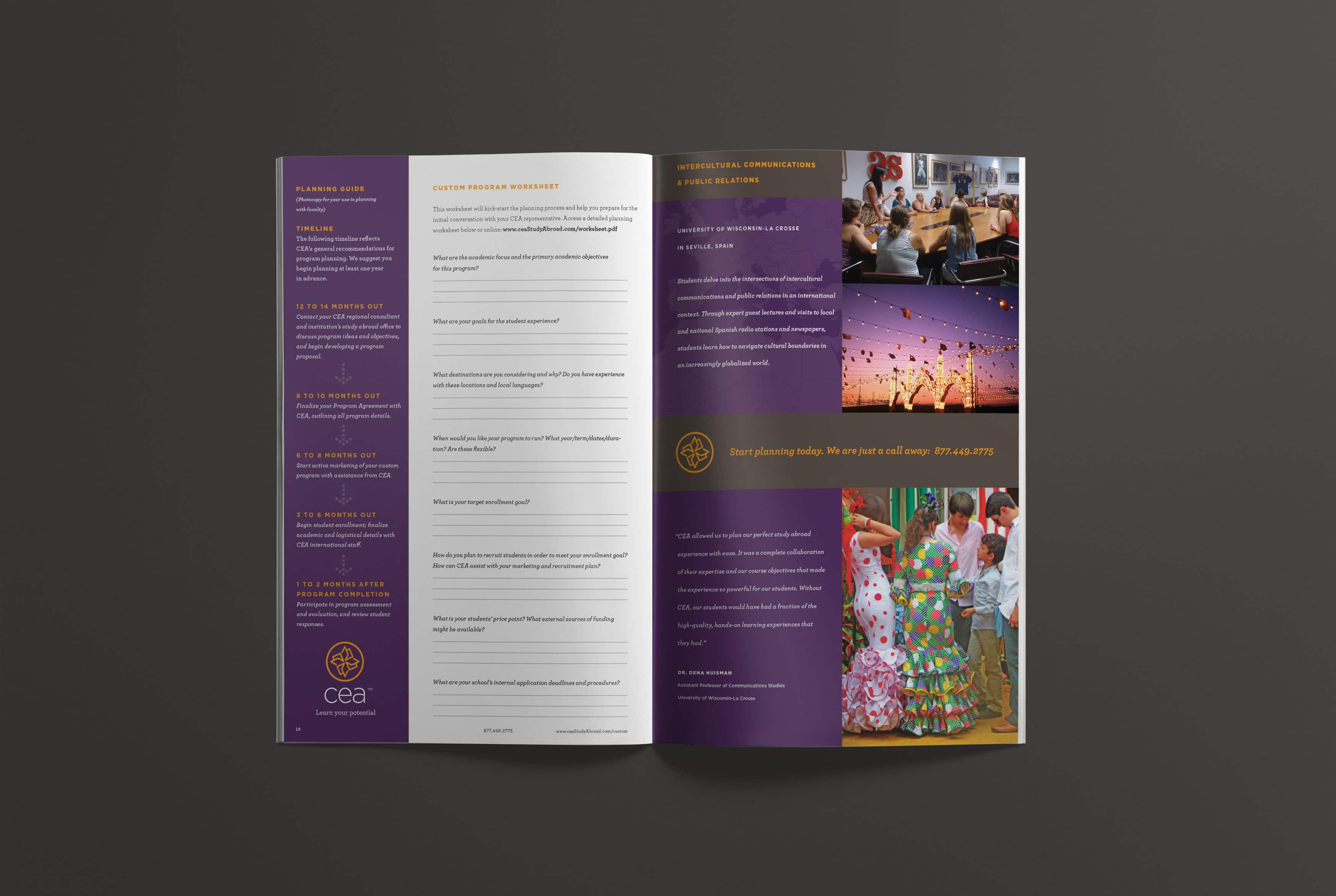
With brand standards in place, we set out to introduce the brand through brand ambassadors and program alumni at college campuses. phD designed a suite of marketing and support pieces, including program catalogs for students and a capabilities brochure for existing academic stakeholders and prospective institutions. The 128-page catalog was completely revamped to reflect the new brand and communicate CEA’s values, mission and approach. A 24-page university relations piece clearly lays out the academic and business cases for CEA programs, and a 12-page brochure outlines the process for creating a custom program with CEA. phD also created additional pieces aimed at retaining relationships and contracts under review as well as student recruitment efforts.
Outcome
Students and universities have taken notice of CEA’s rebrand. The initial print run of catalogs ran out in record time, requiring an additional run to meet demand. Affiliations and enrollments are up. Contracts at partner universities are being renewed, and students now look and ask for the brand by name at study abroad fairs on campuses across the country.
Does your brand align with your mission?