Architecture Firm Branding for Stance
When a young architecture studio was planning its launch, they tapped phD for a bold, modern brand identity that is as innovative in its approach as they are.
IndustryProfessional Services: ArchitectureClientStance ArchitectureEngagementBrand Identity, Brand Standards, Brand Extension, Type Design, Print Design
Overview
Located in Phoenix, Arizona, Stance is a young architecture studio working at the intersection of contemporary design, digital fabrication, and computational modeling. Having left a nationally recognized firm to start his own, Stance’s founder wanted an unconventional and bold perspective on branding for his architecture firm that reflected his approach to design.
Approach
When developing branding for architecture firms, we seek to visually distill a firm’s essence and express it in a beautiful, unexpected, and memorable way.
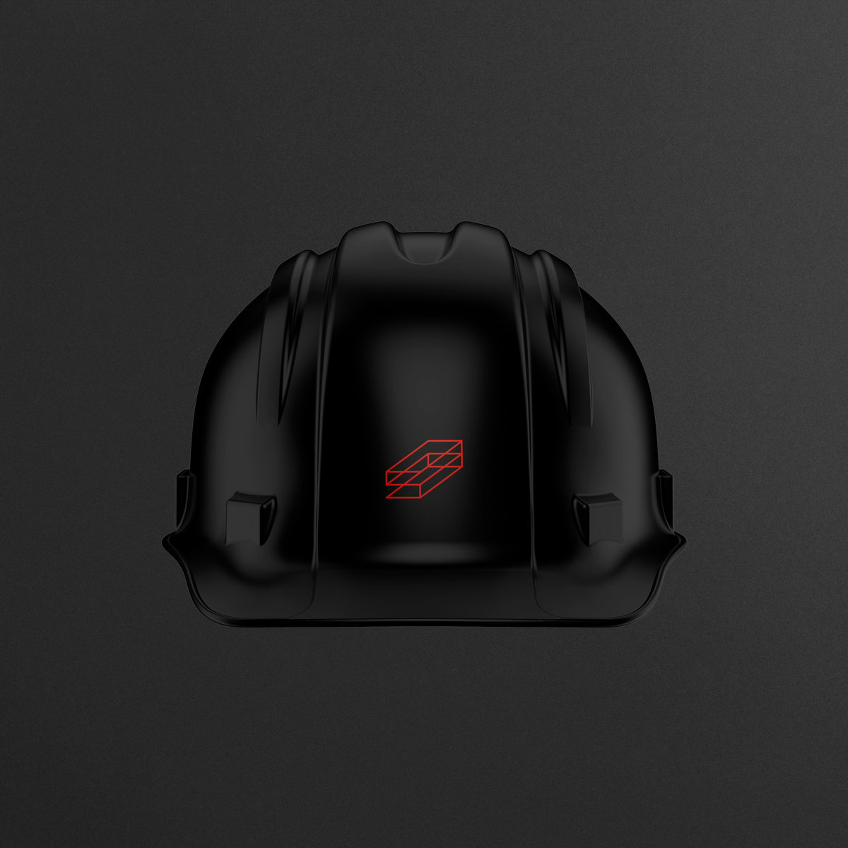
We approached the visual identity for Stance as a living, dynamic entity. As the foundational underpinning of the architecture firm’s branding program, we created a family of structural marks comprised of simplified S and A forms that morph and extrude into a series of dimensional planes representing building envelopes. The resulting group of marks parallels the architecture firm’s own iterative process of exploring program, material, form, line, and plane to arrive at a seemingly effortless design solution. The marks are anchored by a stacked typographic signature, which can be used in conjunction with the logos or as a standalone, secondary mark. The full family of marks appears across Stance’s communications materials. In digital applications, the 12 marks become one, stretching and shifting from iteration to iteration.
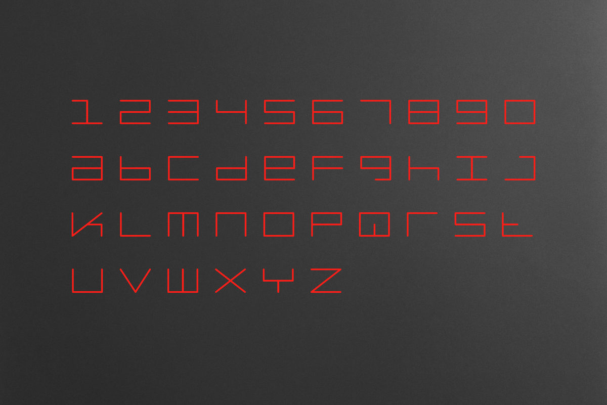
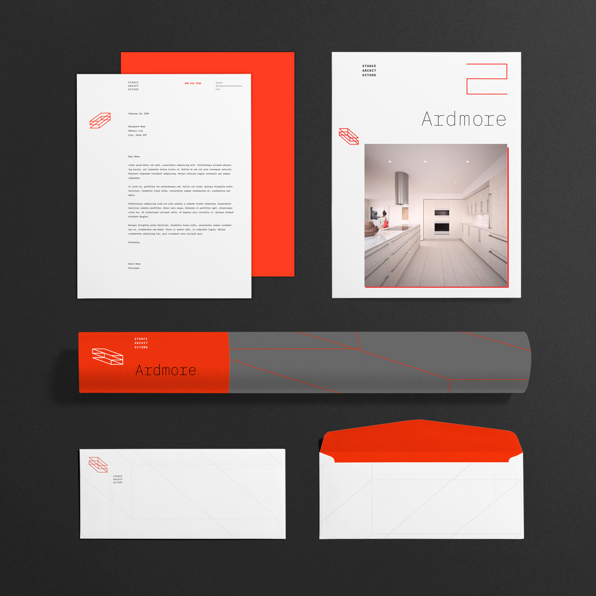
As part of the project, we designed a custom, modular display typeface in two weights for use in conjunction with the identity. A suite of business papers, proposals, and presentation materials rounds out the identity program. Double hits of intense, fluorescent red ink, paired with subtle but substantial production materials and processes, are used throughout the architecture firm’s branding program, echoing its personality while ensuring that the brand identity differentiates the firm in an increasingly crowded market.
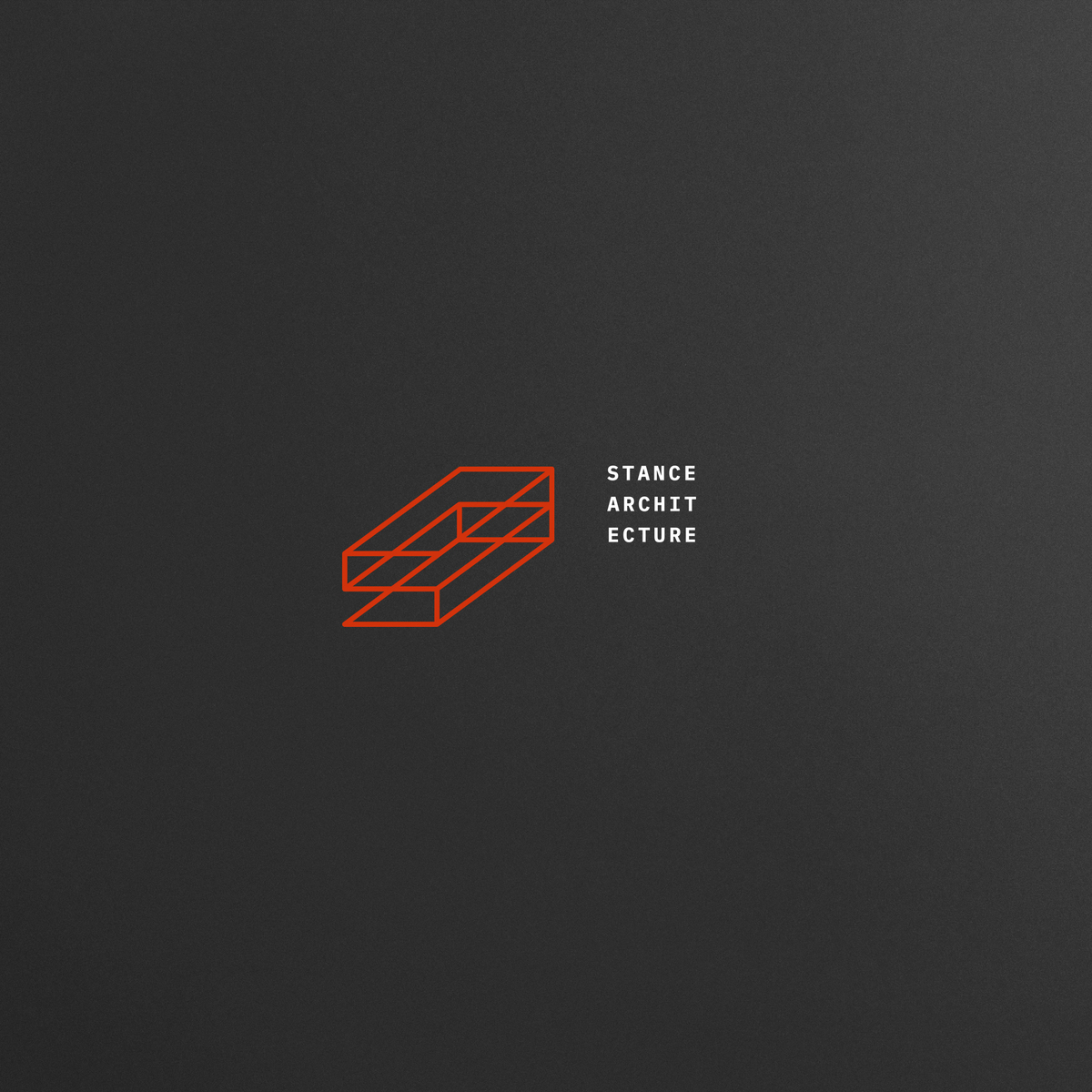
We approached the visual identity for Stance as a living, dynamic entity. As the foundational underpinning of the architecture firm’s branding program, we developed a family of structural marks comprised of simplified S and A forms that morph and extrude into a series of dimensional planes representing building envelopes.
Need to stand out?