Branding and packaging design fora line of luxury self-care products
Visual Identity and Packaging for Beaumondes
Creating an extendable brand identity and packaging system that embodies a passion for self-care and a refined aesthetic.
IndustryRetail, ConsumerClientBeaumondesEngagementBrand Strategy, Visual Identity, Collateral Design, Packaging Design
Background
Beaumondes is an independent company based in Scottsdale, Arizona that offers small-batch skin and beauty care products. After investing considerable time refining product formulations, Beaumondes asked us to create a visual identity and packaging that conveyed the owner’s passion for beauty and skin care with her aesthetic sensibilities.

Approach
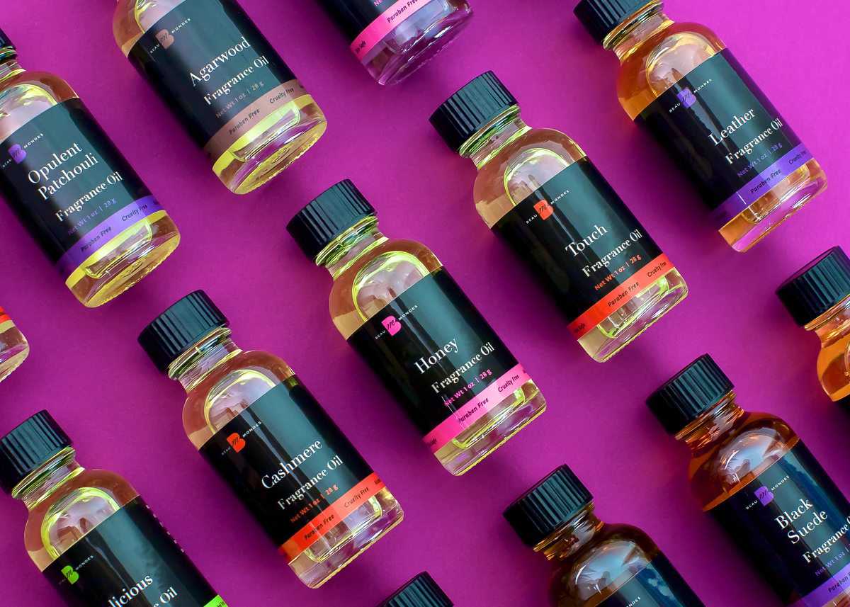
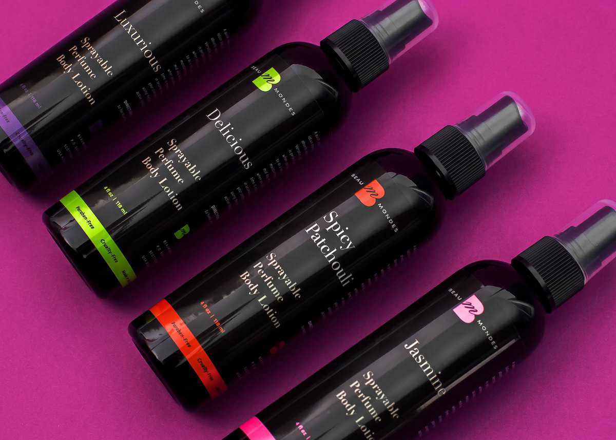
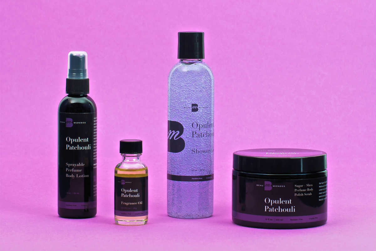
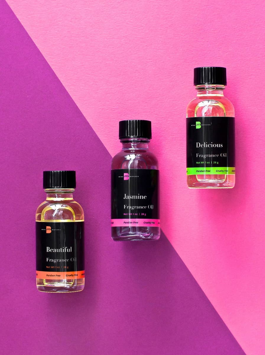
The visual identity and packaging design convey a modern take on traditional luxury. With 120 natural product formulations and five product categories in Beaumondes’ line, we devised a color-coded taxonomy of seven fragrance classifications and set our focus on designing a packaging system that distinguished each product while also elevating the Beaumondes’ brand.
Our design strategy centered on marrying a modern design approach with classical typography. Bright pops of color combine with a dark base to convey understated and elegant style on packaging for oils, lotions, shower gels, liquid soaps and scrubs. In instances where the product was visually appealing, we showcased it as a key visual to inject variety and interest into the packaging design system.
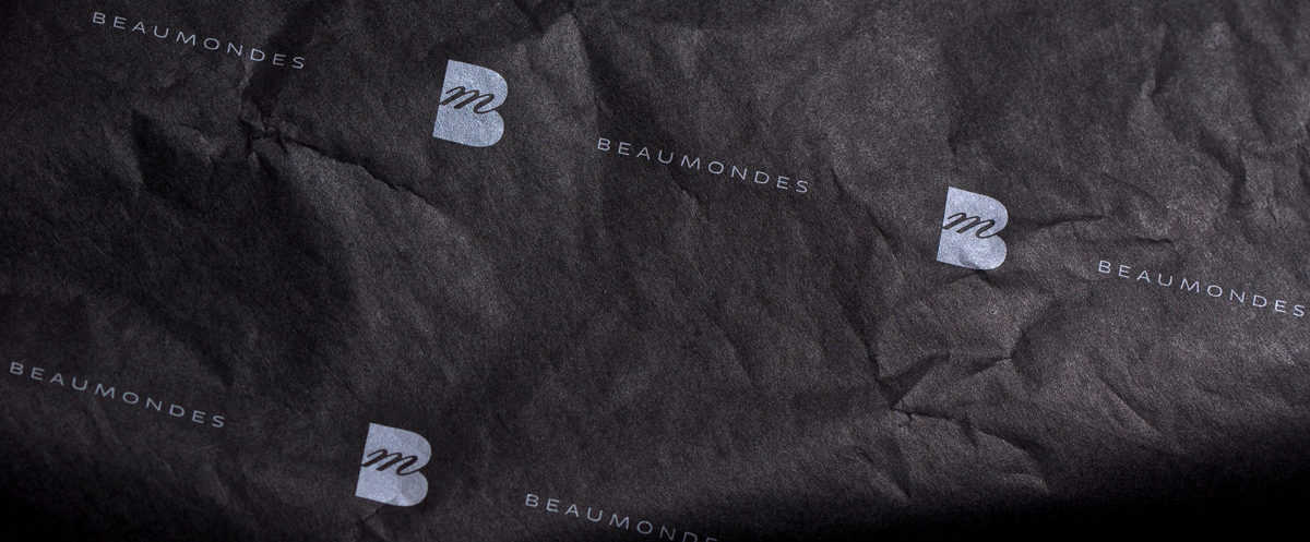
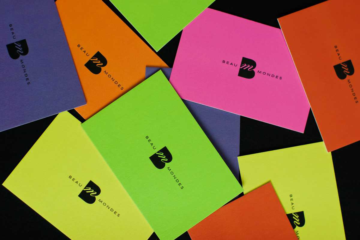
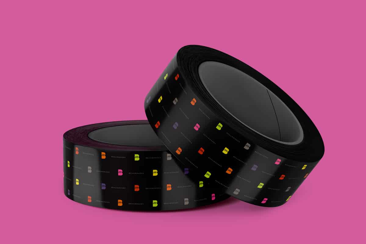
Custom packing tape, tissue paper, sample cards and thank you cards round out the system and ensure a professional and elegant presentation inside and outside the box.
Need to differentiate your product?