Case Study:Breitfeld & Schliekert, GmbHEvolving a global brand with deep heritage
With a proven track record of success in delivering well-considered and well-designed optical tools and parts, Breitfeld & Schliekert realized their brand identity wasn’t keeping pace with their innovation or growing global reach. Breitfeld & Schliekert asked phD to explore the issue, develop recommendations and design the way forward.
IndustryOptical ManufacturingClientBreitfeld & Schliekert, GmbHEngagementNaming, Corporate Identity, Brand Development & Extension
Background
Founded in 1927, Breitfeld & Schliekert is Europe’s #1 brand for the manufacture and supply of tools, machinery and repair parts for opticians. Breitfeld & Schliekert has been a design driven company since Dominik Finkeldei took the helm in 1997. From award-winning industrial designs for tools to the design of process flows and service deliveries, Breitfeld & Schliekert leave nothing to chance when it comes to their products and services and their brand.
Approach
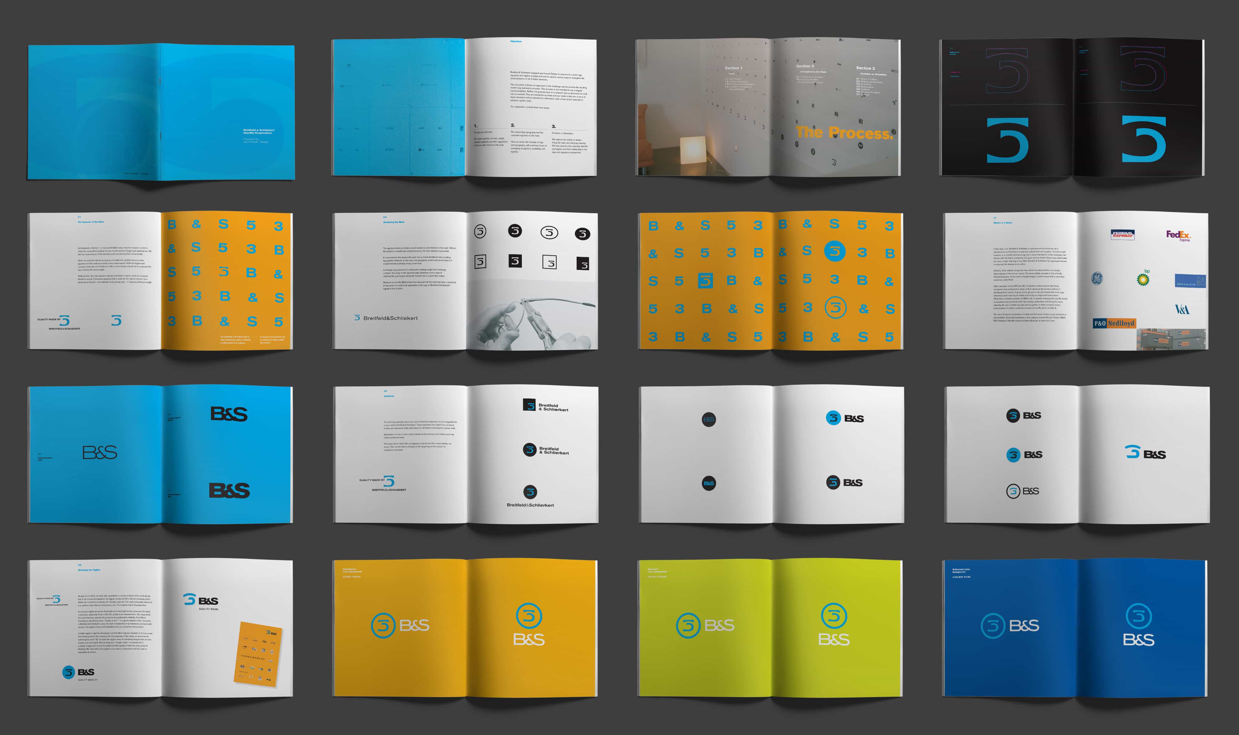
Having worked with Breitfeld & Schliekert successfully on their US launch and other brand initiatives, we were thrilled when they returned to phD to lead them through an evaluation and evolution of their global corporate identity. Breitfeld & Schliekert’s logo had been in use for most of the company’s 75+ year history, so we were careful not to compromise any hard-earned brand equity. The process for development of the identity unfolded in two phases. The first phase resulted in the evolution of the logo launched and currently in use today, and the second phase explored what a further evolved mark might look like for future consideration.
Brand Refinement Process & Exploration
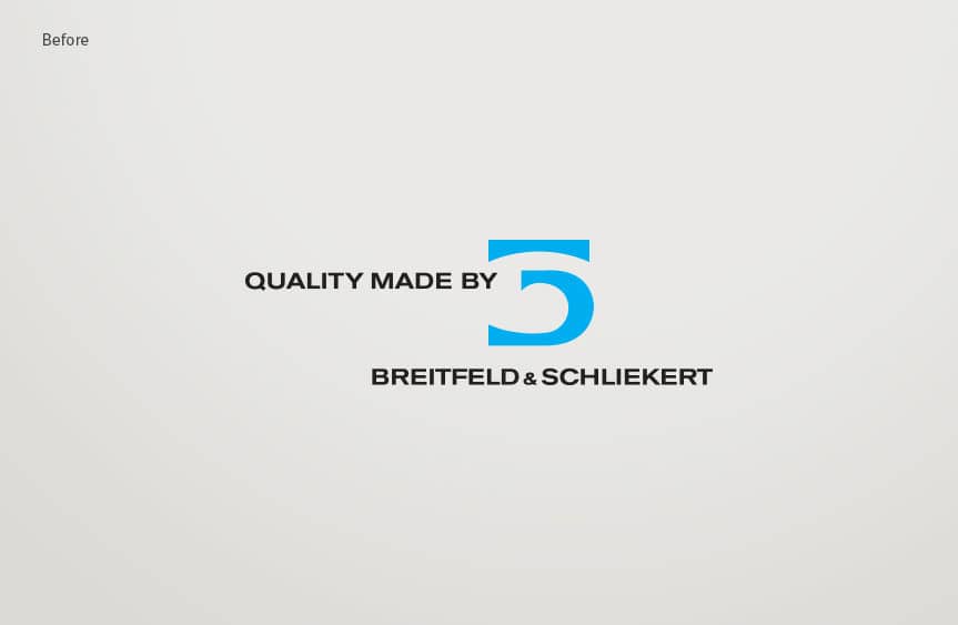
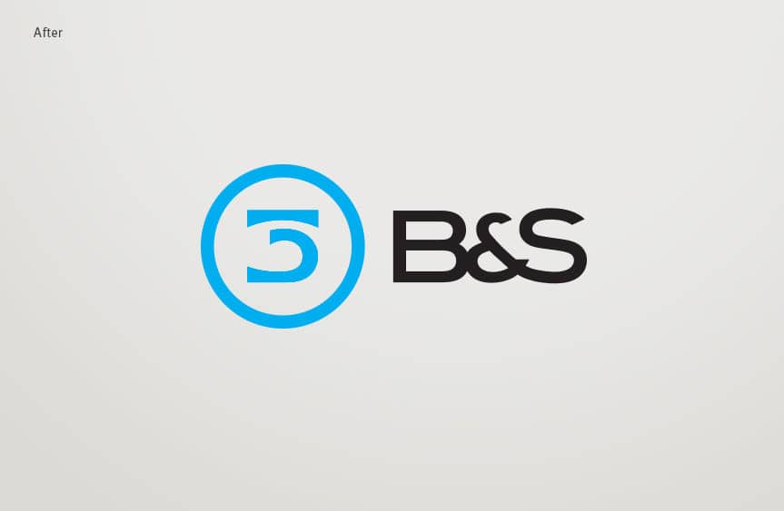
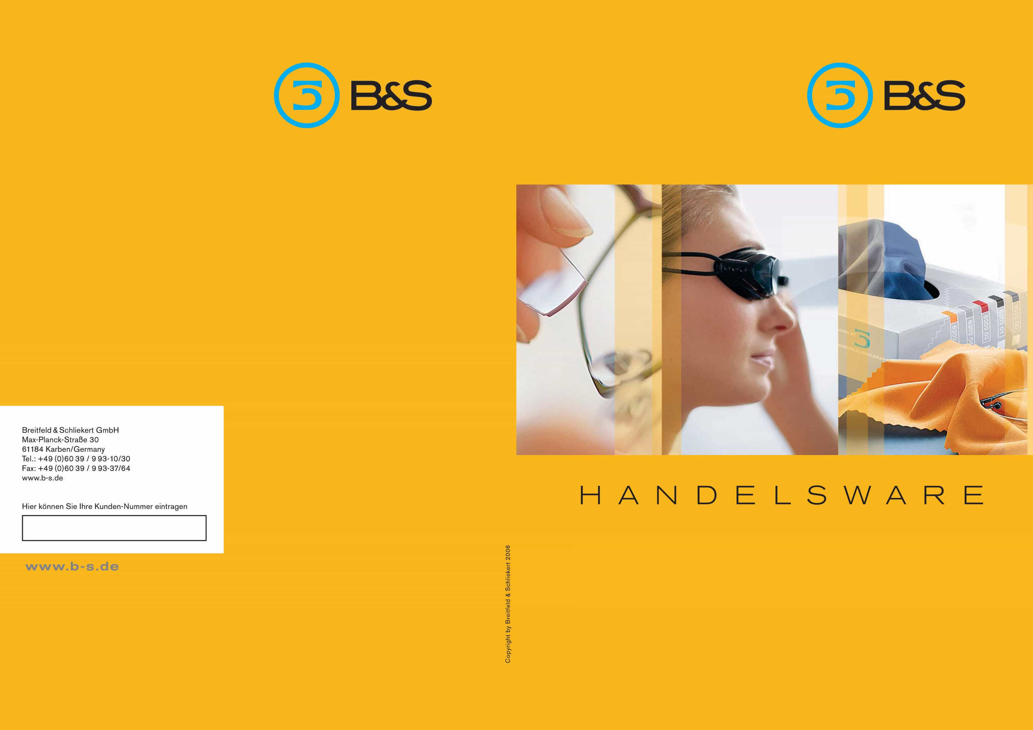
Working closely with Breitfeld & Schliekert and their German agency of record, phD embarked on an 18-month discovery and design process to examine, explore and update the brand identity of the company. Together we had many discussions about the relationship of the name to the existing logo and strap line. While the name’s German heritage was a plus in its association with quality and design, customers outside Germany and the European continent struggled with pronouncing and spelling the name. Additionally, the length of the name in combination with the existing strapline made visibility in large and small formats less than optimal. Ultimately we changed the name to B&S and developed a custom typographic signature for use with an updated logo.
Outcome
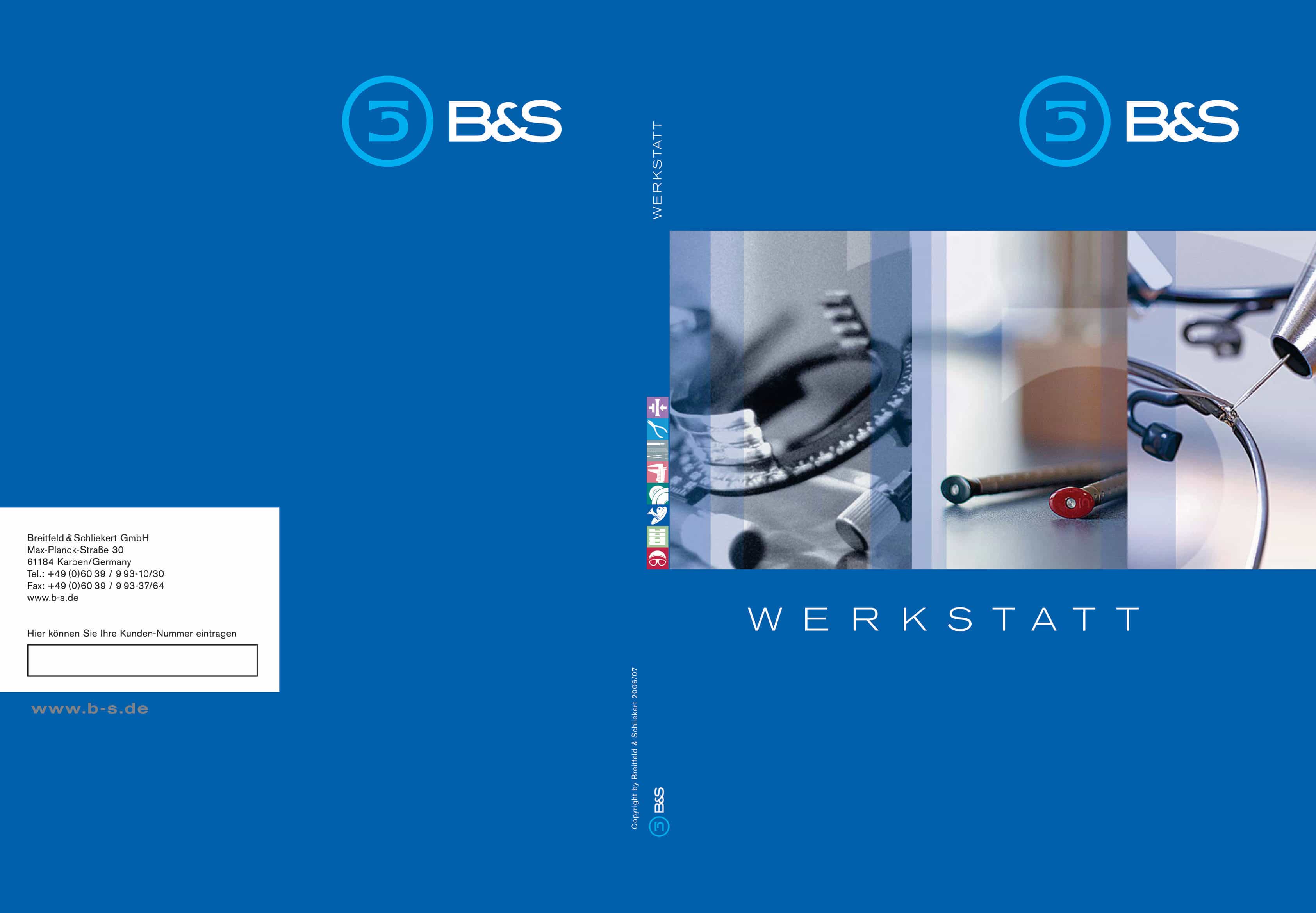
The decision to change the name and evolve the logo was well received by clients both at home and abroad. Existing and new customers embraced the name and look, sales continue to grow year over year and B&S continues to be the leader in its field.
phD continues to consult with B&S on design and identity initiatives. Most recently we designed and developed the brand identities of several new lines of value driven products and services, as well as a spin-off entity specializing in investments in the optical industry.

