Case Study:Show Low Bluff Brand IdentityCreating a sense of place before the place exists
Case Study: Show Low Bluff Brand Identity
With ground broken — but few improvements and no homes yet completed — our challenge was to craft a new brand identity and create an introductory campaign to connect with second-home buyers.
IndustryReal Estate DevelopmentClientShowlow BluffEngagementStrategy, Branding, Advertising, Print, Web & Interactive, Environmental Design, Exhibit Design
Background
From the very beginning, Show Low Bluff had been conceived, planned and developed as a unique community. Situated on 1,500 acres in the White Mountains of Arizona, Show Low Bluff would provide a distinctive lifestyle reflecting a simpler time when people knew their neighbors, while integrating the conveniences and cutting-edge technologies of today. In order to secure additional investment and jump start sales, the developer needed to convey the vision and promise of Show Low Bluff, before having built it. Show Low Bluff contracted with phD to lead the creative effort and craft a logo and brand identity representative of the development.
Approach
Our research informed the planning of the property and the development of the marketing. It revealed Baby Boomers as the target demographic interested in value, community, and fun. The tagline “Discover your own frontier” conveys the idea of individuality, letting the consumer define his or her experience — a retreat from the city, a bustling small community, or an escape into the outdoors.
Logo & Brand Identity
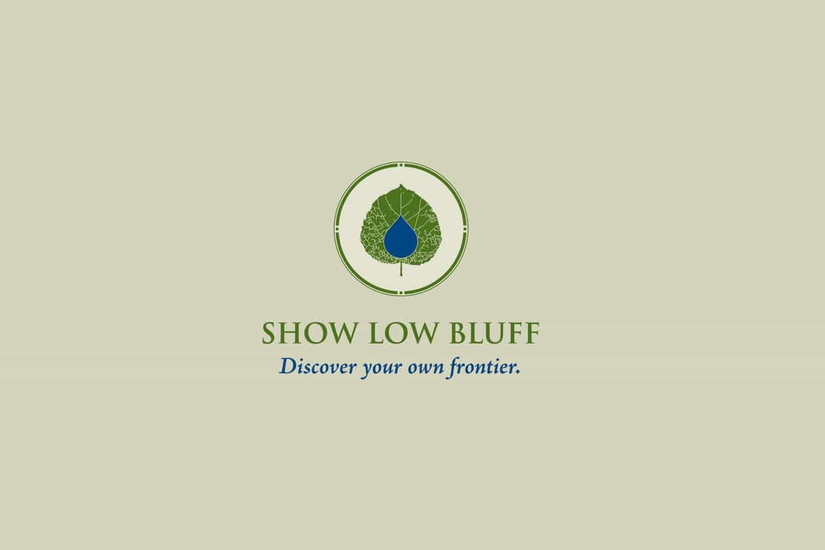
A single aspen leaf and drop of water represent Show Low Bluff. Its form is rough hewn, and clearly connected to the outdoors. Grounded in nature like Show Low Bluff itself, the logo communicates vitality, community and balance. It evokes a sense of place, one of tranquility and harmony.
Elements of the mark reference the simplicity and detail of the Craftsman-inspired architecture, while the color palette draws directly from nature and Show Low Bluff’s surroundings. The leaf veins allude to a multitude of hiking and biking trails. The water drop represents the abundance of this precious resource upon which residents and their guests will play, navigate or simply gaze.
Outlining the mark are two concentric circles, which speak to the community that is Show Low Bluff: unified, strong and in balance with its natural surroundings.
Outcome
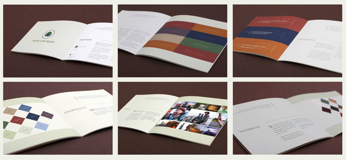
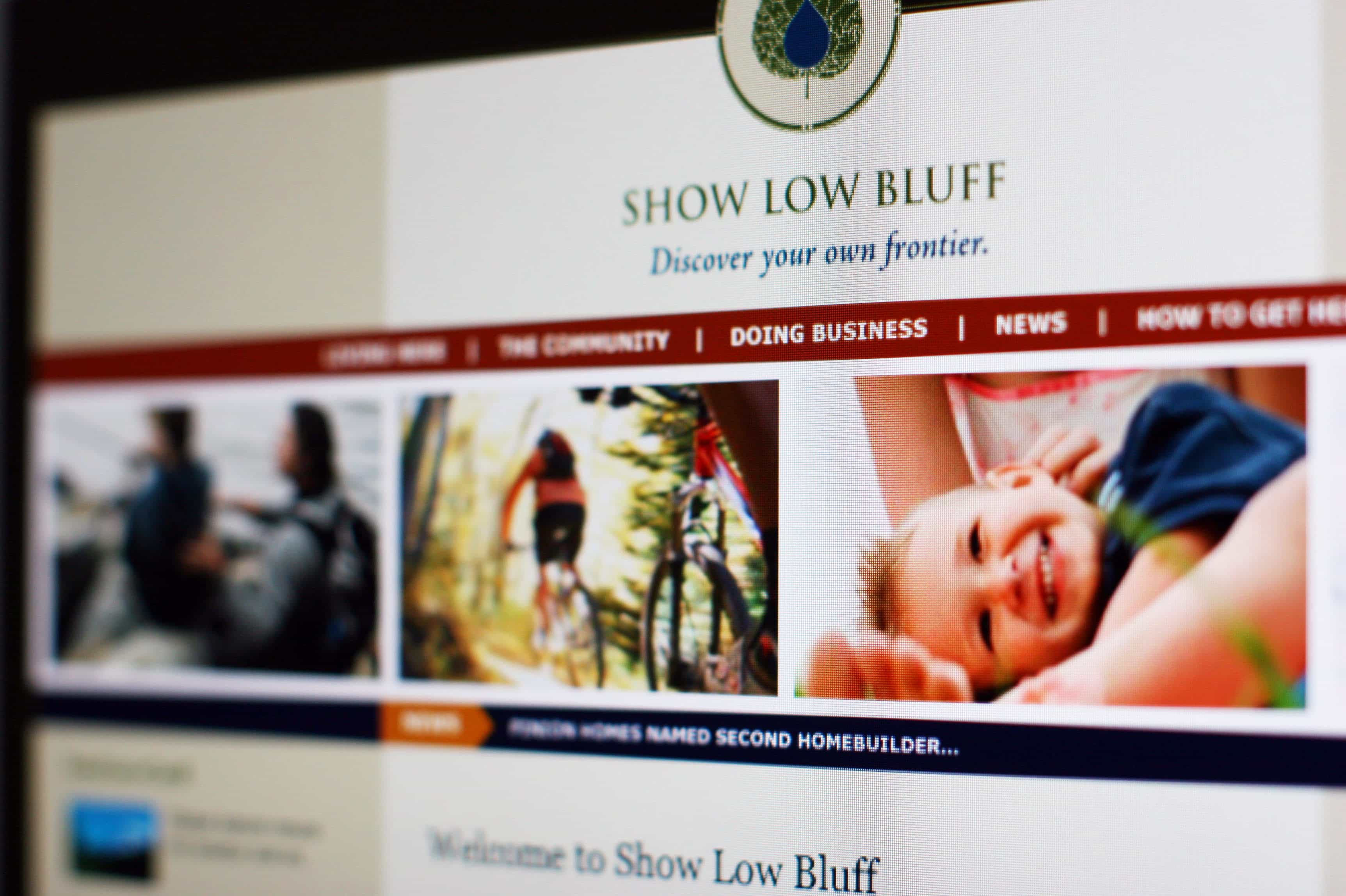
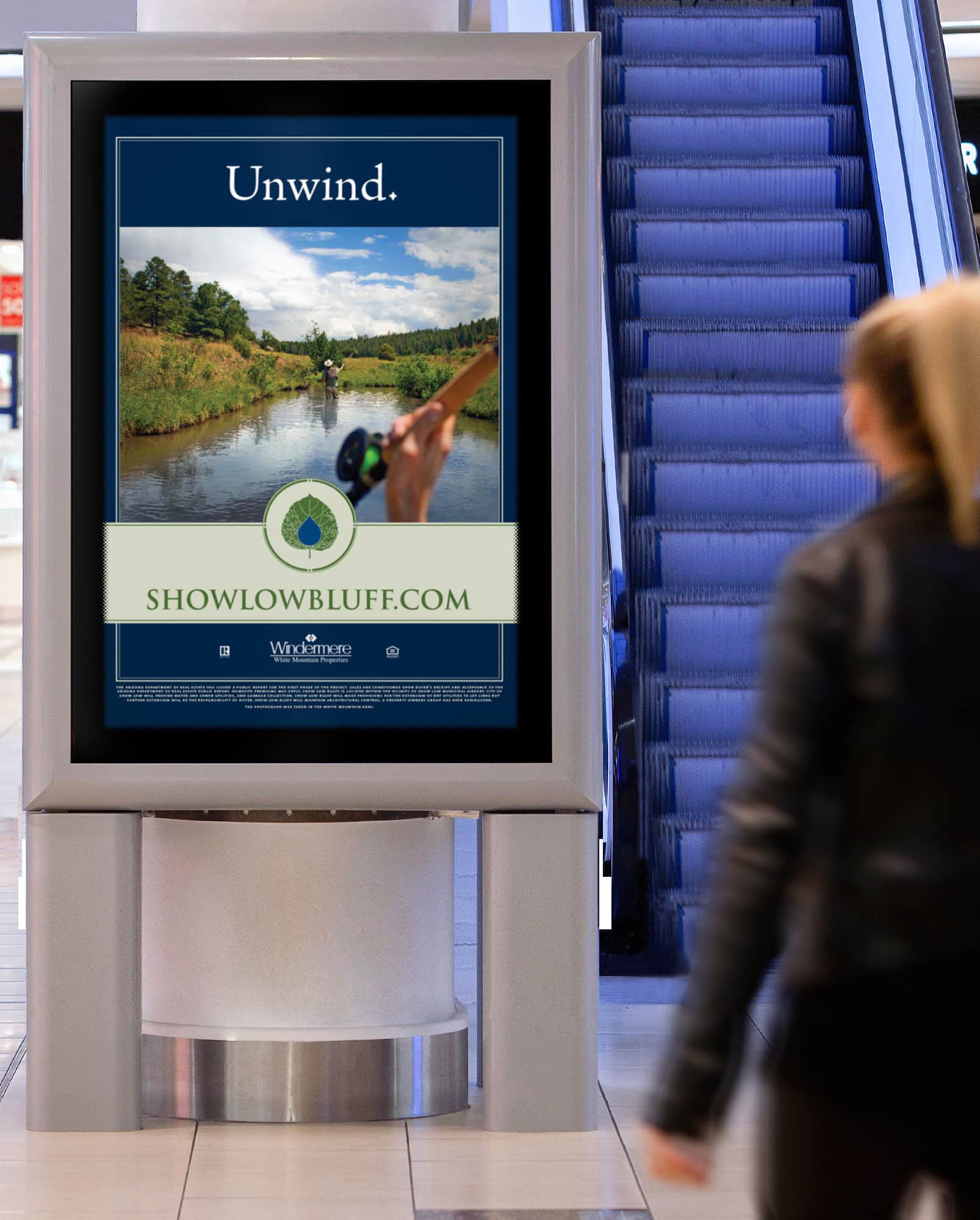
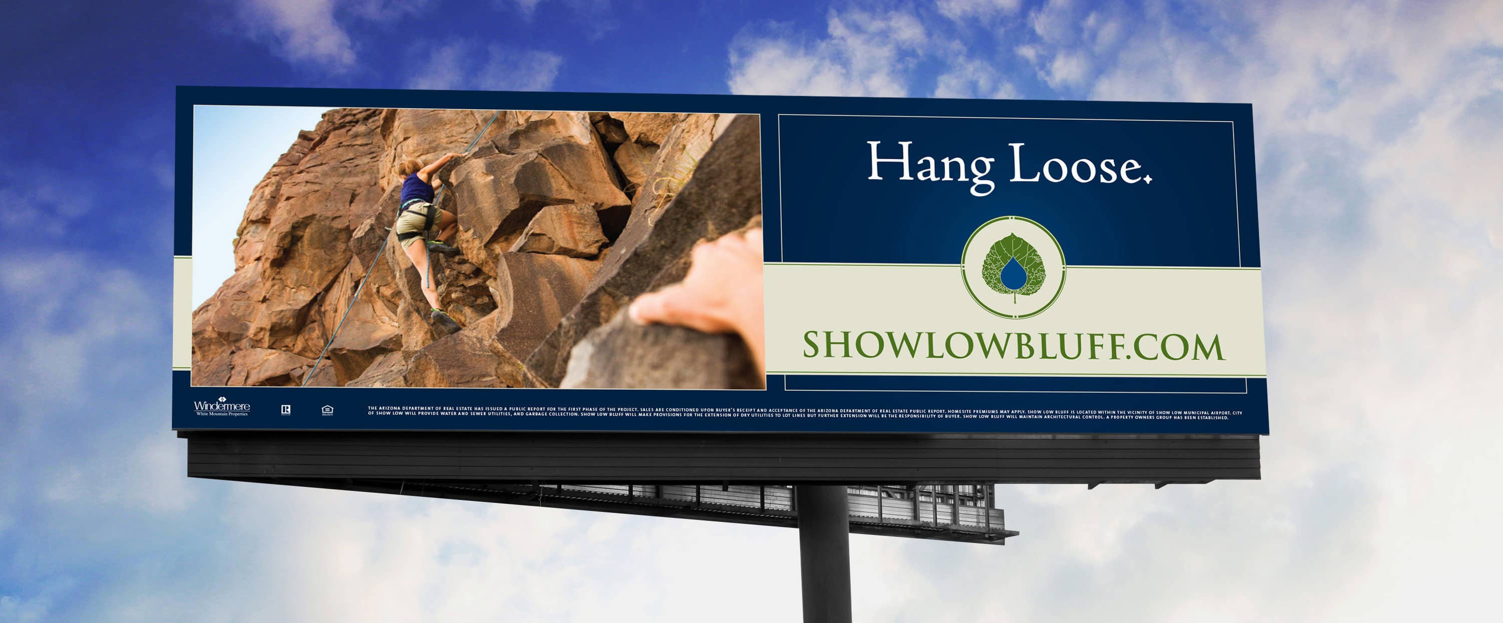
phD communicated the vision for the development and the brand identity to key stakeholders and investors through a comprehensive brand book and website developed with our technology partner. We then set out to raise consumer awareness with an out-of-home teaser campaign. The introductory campaign captured the experience of living at Show Low Bluff from an owner’s point of view, in the moment, and engaged in mountain biking, kayaking and other recreational and social activities. Designed as a teaser campaign, it did not tell the whole story, but focused on piquing consumer interest to drive traffic to a companion website. The campaign combined out-of-home, radio, print and television advertising. The result: web traffic quickly tripled during the short run of the campaign.
Does your brand identity capture the essence of your business?

